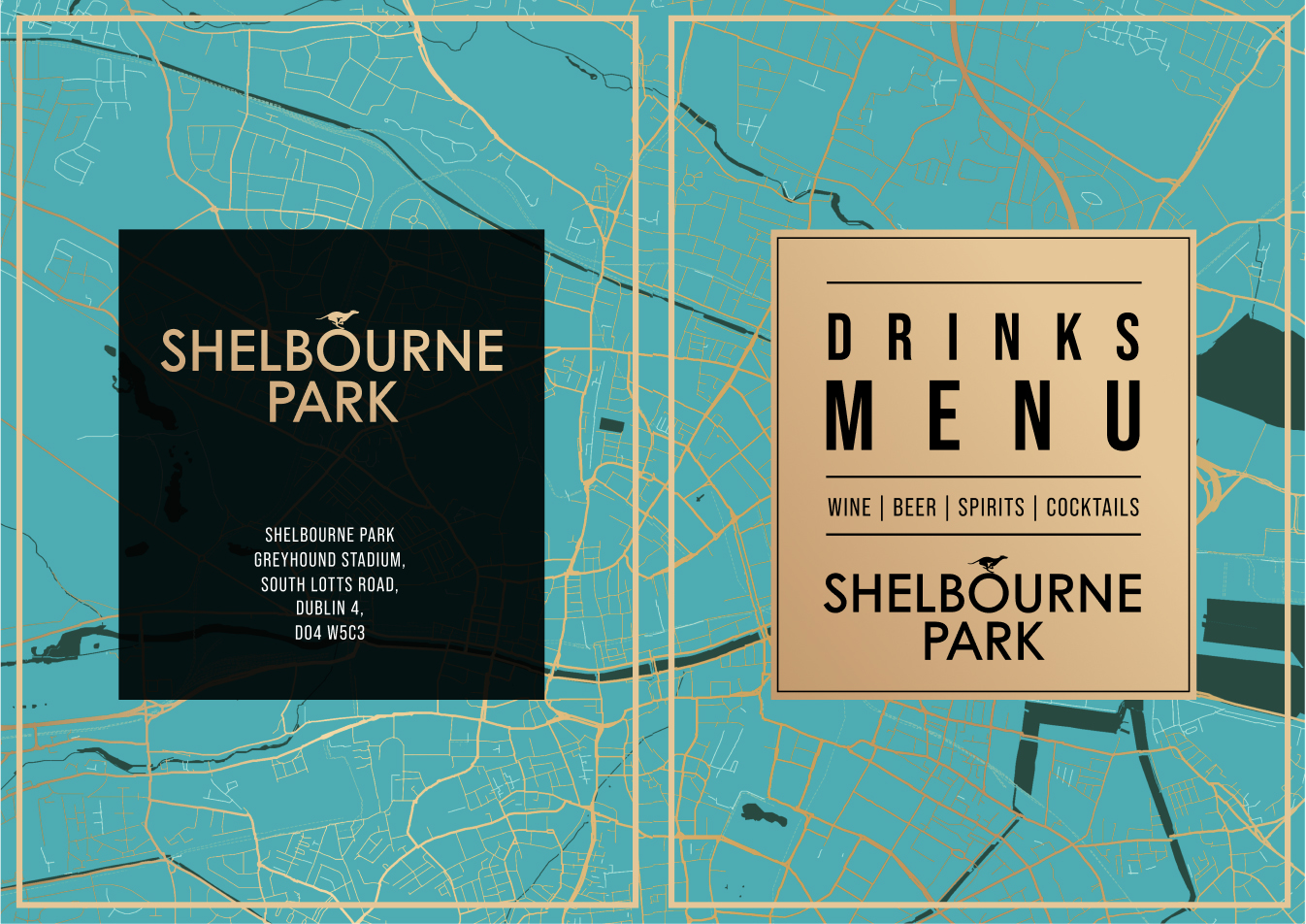
Client: Greyhound Racing Ireland (GRI)
My role: Lead brand and UX designer
Objective: To revitalise the brand identity of Shelbourne Park, a historic Dublin landmark, aligning it with contemporary design trends and positioning it as a premier entertainment destination.
Timeframe: 6 months
Background
Shelbourne Park, a beloved Dublin institution, has a rich history dating back to 1927. However, the brand had become outdated and lacked the vibrancy to attract a new generation of fans.
The multi-million euro refurbishment project presented an opportunity to not only modernise the physical space but also to reimagine the brand.
The Challenges
- Outdated Brand Identity: The existing brand was perceived as old-fashioned and lacked a strong visual identity.
- Competing for Attention: The entertainment landscape in Dublin is highly competitive, with numerous options for nightlife and sporting events.
- Attracting a Younger Audience: The sport of greyhound racing needed to appeal to a younger demographic, particularly those unfamiliar with the sport.
Initial Drafts
After conducting thorough research and competitive benchmarking of similar venues and stadiums, I developed initial sketches and drafts. These were shared with the Head of Brand for feedback and refinement. Once finalised, these concepts were presented to GRI's board of executives.
A rebrand of the GRI (RCE|GRI) identity was also being considered at this point.
Following Shelbourne Park's rebrand, this new look would be rolled out nationally to the 7 other greyhound stadiums.
Colour considerations
While I explored various colour palettes, Shelbourne Park’s new colour scheme emerged early in the project. The desired “classic and clean” aesthetic naturally led to the selection of black and white as foundational colours.
The addition of a copper gradient, inspired by LAM Architects’ mockups, introduced texture, depth, and a premium feel. This choice also subtly nods to the venue’s heritage.
The addition of a copper gradient, inspired by LAM Architects’ mockups, introduced texture, depth, and a premium feel. This choice also subtly nods to the venue’s heritage.
View the presentation here.


%20(Large)%20(1).JPG)
%20(Large)%20(2).JPG)
%20(Large)%20(2).JPG)


.jpg)
.jpg)


